first of all, no offense! I really appreciate all the kit makers for their effort to make this game better for other users. ") but some small tricks can make their work more natural.
but some small tricks can make their work more natural.
we all want to look like official kits and look natural in the game. some kit makers are very accurate about design details
I hope we can get some qualify kits and (better then file quality) for pes 2019 by observance of some points.
most of the kit makers usually use saturation colors and shiny colors to make a kit. en make the kit look unnatural and cartoony.
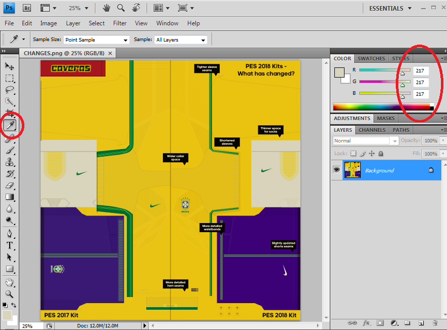
if you consider Konami official kits you can get some hints. (remember this Brazil official kit to show change between pes 2017 and pes 2018?)
its white is (RGB 217/217/217) (not 255/255/255)
black is (RGB 40/40/40) (not o / o / o)
and other colors have not a factor on 0 or 255
generally if you keep all factors above 40 and under 217, you will get more natural color.
for example about most shiny red color in the game, can be (RGB 217/40/40) (not 255/0/0). I think we can consider (217/40/40) as a limit for most shiny red in the game, and of course for a regular red I prefer less contrast like (RGB 185/55/55). (all of these examples are about pure red ... but for another example: if it trend a little to pink the Blue factor should get bigger value than the Green one)
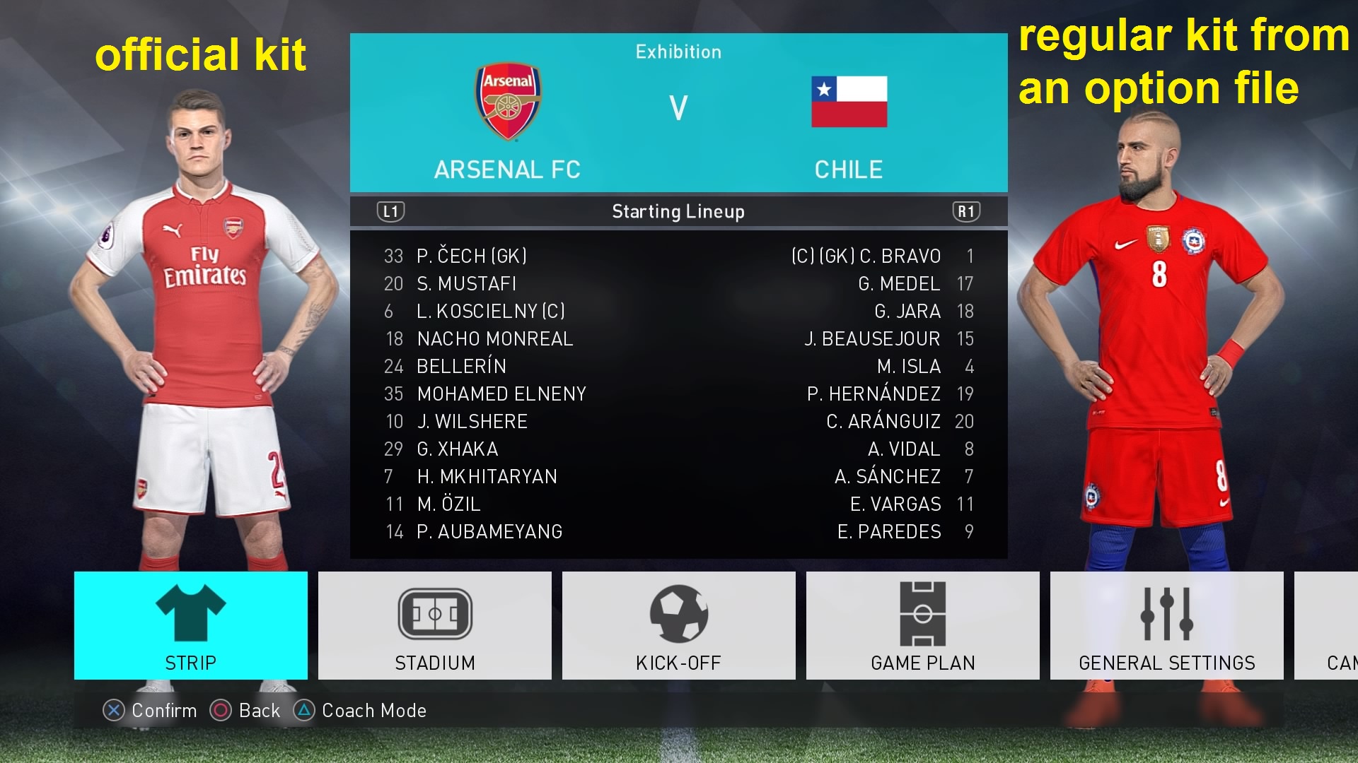
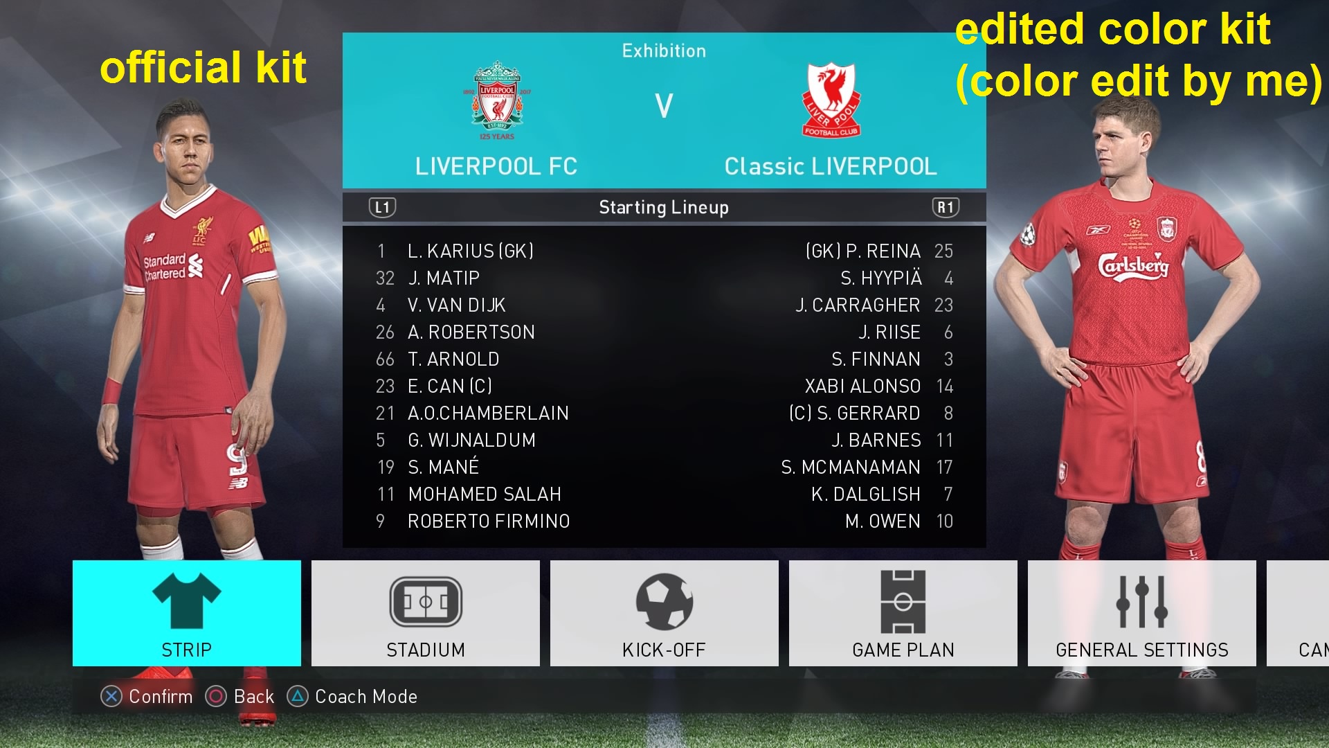
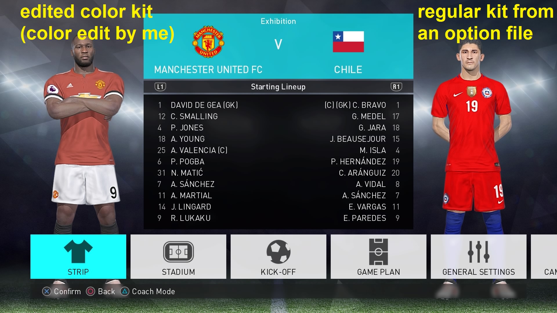
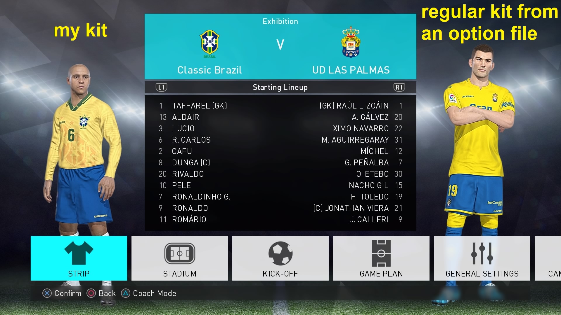
now compare some of my kits(or edited color by me in this method) and some official kits and some regular kit from an option file.
which one is more natural and more look like an official kit?
so you can make your kits look like official too
but some small tricks can make their work more natural.we all want to look like official kits and look natural in the game. some kit makers are very accurate about design details
I hope we can get some qualify kits and (better then file quality) for pes 2019 by observance of some points.
most of the kit makers usually use saturation colors and shiny colors to make a kit. en make the kit look unnatural and cartoony.
if you consider Konami official kits you can get some hints. (remember this Brazil official kit to show change between pes 2017 and pes 2018?)
its white is (RGB 217/217/217) (not 255/255/255)
black is (RGB 40/40/40) (not o / o / o)
and other colors have not a factor on 0 or 255
generally if you keep all factors above 40 and under 217, you will get more natural color.
for example about most shiny red color in the game, can be (RGB 217/40/40) (not 255/0/0). I think we can consider (217/40/40) as a limit for most shiny red in the game, and of course for a regular red I prefer less contrast like (RGB 185/55/55). (all of these examples are about pure red ... but for another example: if it trend a little to pink the Blue factor should get bigger value than the Green one)
now compare some of my kits(or edited color by me in this method) and some official kits and some regular kit from an option file.
which one is more natural and more look like an official kit?
so you can make your kits look like official too
